September 30, 2022
For the first three hundred years of American life, navigating public spaces with a disability was largely the responsibility of the person with the disability. Even a frustrated President Franklin Delano Roosevelt had to commission a custom wheelchair to better navigate his time’s general inaccessibility.
The 1990 passage of the Americans with Disabilities Act (ADA) made the accessibility of public spaces the responsibility of the federal government. The ADA established accessibility standards for cities and businesses nationwide. Local agencies, however, often must work within constraints that make full compliance difficult. Especially in the case of historic buildings and old streets, retrofitting accessible infrastructure into every public space can be an invasive and cost-prohibitive endeavor.
Enter innovative designs and the quick-build project.
Quick-build implementations were initially valued for their ability to temporarily change how streets could be used during the COVID-19 pandemic. However, quick-build project hallmarks-temporary materials, rapid installation times, and modularity-also allow these projects to overcome accessibility obstacles, like a lack of political will or funding. For users with disabilities, quick-builds can provide more immediate relief than more permanent counterparts. Quick-builds’ modular nature means they can be revised if community feedback uncovers new accessibility issues after implementation. But to deliver on this potential, quick-builds must first reckon with their own inaccessibility.
What’s the Catch with Quick-Build?
Ironically, quick-builds’ benefit of immediate relief can perpetuate inaccessibility rather than eliminate it. Because quick-builds are nominally temporary, practitioners may be tempted to cut corners when it comes to complying with ADA standards.
More pressingly, quick-build materials may not be accessible to people with visual disabilities.
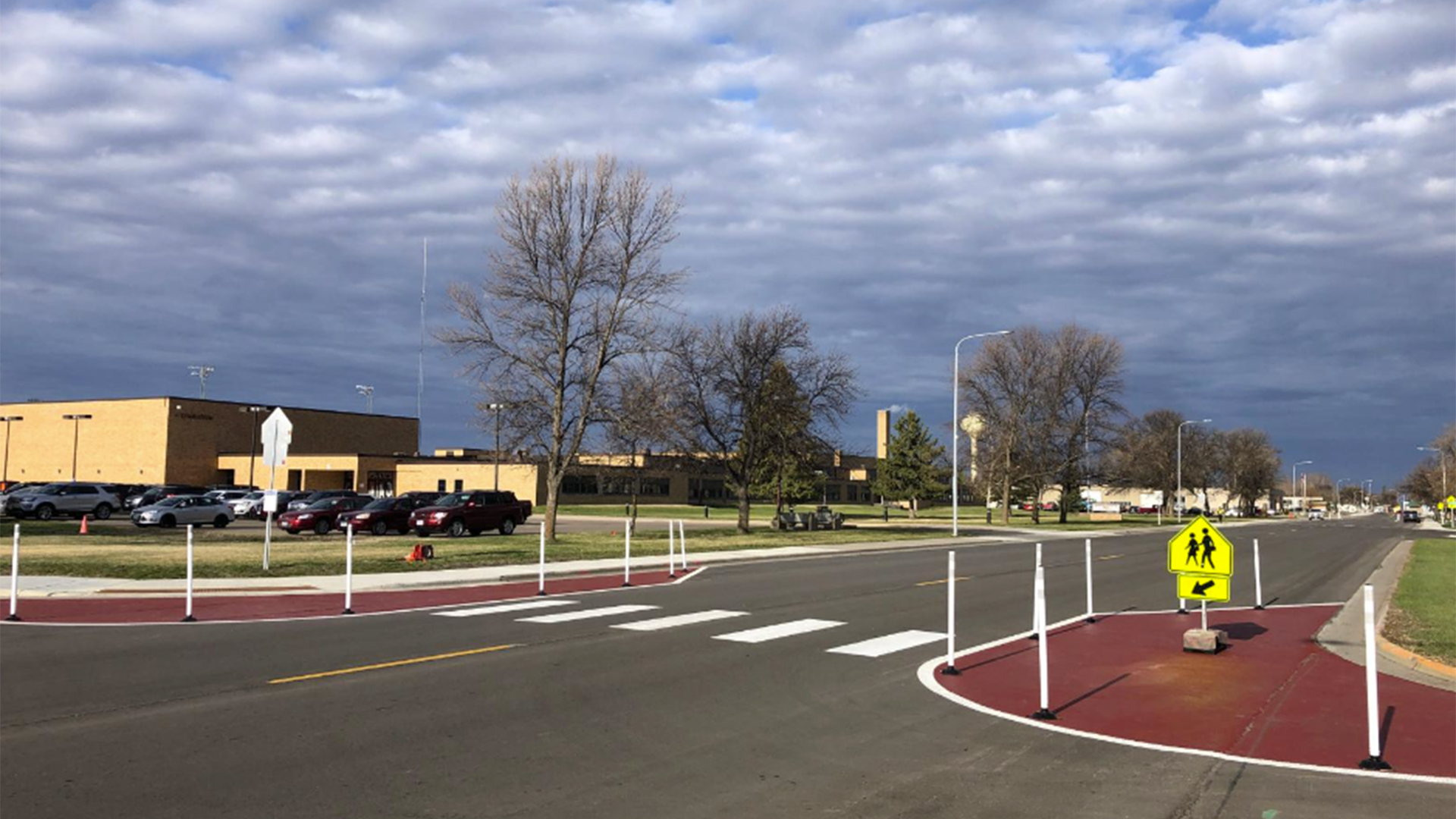
A crosswalk shortened by quick-build curb extensions on both ends. (Photo: MNDOT)
Curb Extensions and Bulb-outs
A curb extension or bulb-out shortens the length of a crosswalk, decreasing the crossing distance for people traveling on foot or by bicycle, and can calm motor vehicle traffic. However, the typical quick-build implementation for these strategies-plastic flex posts and paint to demarcate the curb’s expanded perimeter-can pose difficulties for individuals with visual disabilities.
While flex posts offer a ready visual cue for the reshaped curb’s new boundary, individuals with visual disabilities may not have access to this cue. Future guidance on the treatment will ideally suggest a nonvisual way of signaling to individuals the new curb parameters, such as tactile directional indicators or accessible pedestrian signals with messaging about the new crossing.
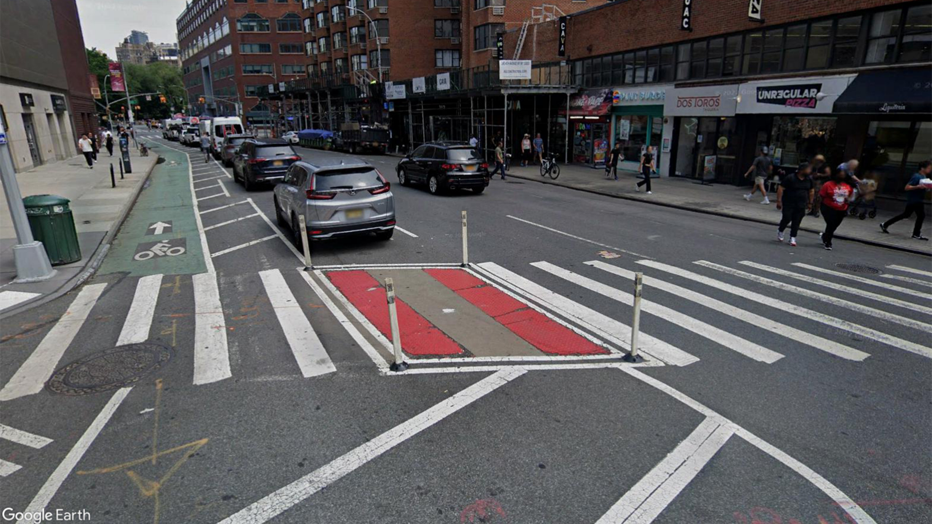
A crosswalk shortened from the use of a quick-build median. (Photo: Google Earth)
Median Islands and Pedestrian Refuges
Median islands and pedestrian refuges provide a midpoint resting place for pedestrians crossing busy intersections. When installed, they can make crossings safer by increasing the visibility of those walking and by calming car traffic.
Quick-build median islands also rely on widely spaced flex posts and paint to delineate the islands’ beginnings and ends. The wide spacing of these flex posts poses difficulties to individuals with visual disabilities, who may not encounter the posts at all or who may interpret them only as obstacles in the street.
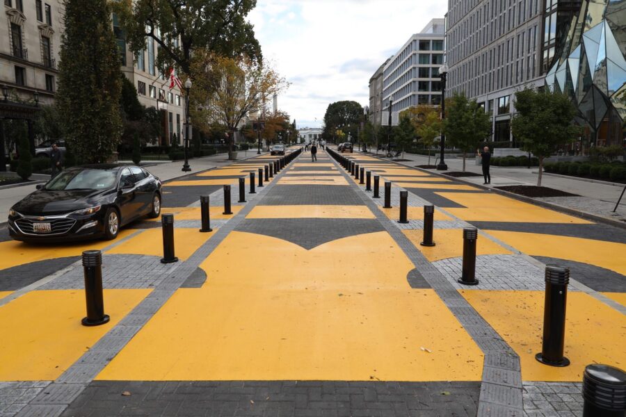 Future guidance may suggest modeling accessible quick-build medians after the median in D.C.’s Black Lives Matter Plaza. This median reserves a middle lane that stretches the length of the plaza for individuals to use as a walkway. A combination of detectable warning surfaces and tactical direction indicators provide continuous tactile cues along either side of the median, conveying to users with visual disabilities where the walkway ends and car traffic begins. Each end of the walkway is also outfitted with accessible pedestrian signals to facilitate crossing
(Photo: Tyrone Turner / DCist / WAMU)
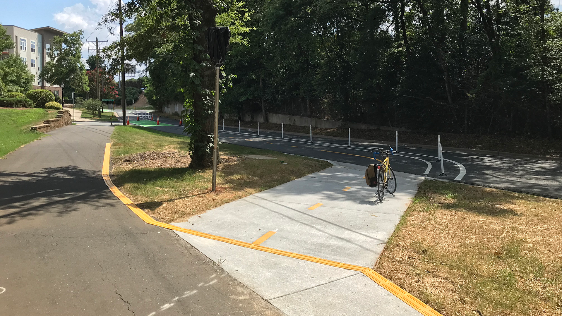
This bicycle ramp in Charlotte, NC considers how both people biking and people with visual disabilities will need to use the sidewalk space, with features that increase harmony between the two. (credit: Scott Curry)
Bicycle Ramps
Bicycle ramps facilitate the transition from biking on an on-street bicycle lane to biking on the sidewalk, an at-grade bicycle lane, or a shared use path. While these ramps can increase safety for people biking, they can also create conflict points between people biking and pedestrians with visual disabilities. Accessible installations require considering how individuals with and without disabilities will interact with these ramps, as this knowledge can help reduce conflict points between different types of users.
On 12th Street in Charlotte, NC, where an in-street, two-way separated bicycle lane transitions onto the sidewalk, tactile direction indicators (TDI) were used similarly along the edge of the bicycle ramp to guide pedestrians along the edge of the sidewalk, past the entrance to the bike lane. In this case, the TDI is narrower but extends much farther along the edge of the sidewalk in both directions from the ramp. Instead of being flush with the edge of the sidewalk, it is installed at an approximately 60-degree angle to prevent bicyclists from losing traction as they traverse the bars. Since installing TDI along this ramp, the City has begun reducing the distance which the TDI extends from the ramp in either direction.
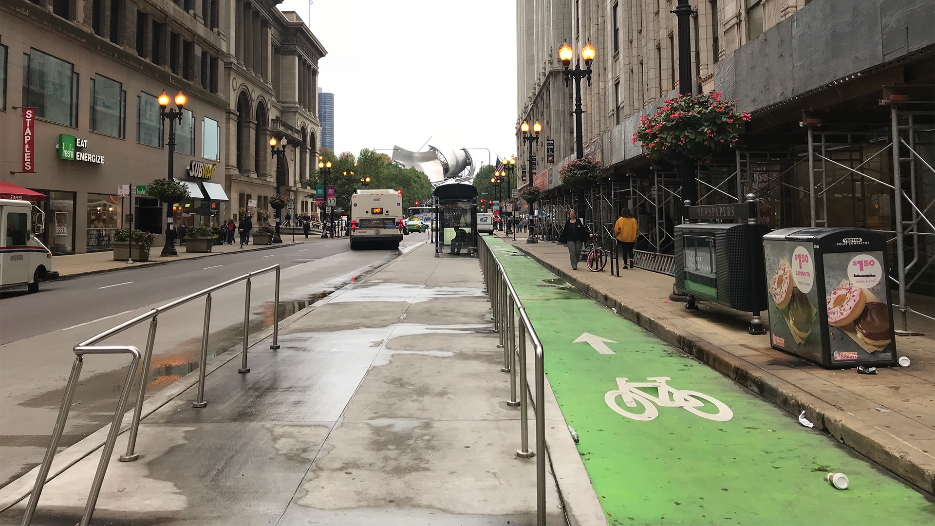
A floating bus island in Chicago, IL.
Floating Bus Islands
Floating bus islands are installed at locations where a bus stop is separated from the sidewalk by a bike lane. They can be installed as quick-build or permanent facilities and the bike lane can be at sidewalk or street level. Implementing a floating bus island can increase safety by reducing conflict points between people biking and buses. However, these islands also raise connectivity questions for users with and without visual disabilities. The floating bus island must seamlessly connect with its surrounding walking and bicycling infrastructure for any user to be able to access it. For people who can see, outfitting the bus island with quick-build ramps and clear crosswalk markings and signage may suffice.
People with visual disabilities require additional cues that work in concert with one another to direct them to an island that is at once part of the pedestrian transportation network and apart from it. To accomplish this, the floating bus island can be outfitted with specific features, like accessible pedestrian signals, detectable warning surfaces at all transition points, and high color contrast on crosswalks.
Additionally, preliminary findings suggest implementation consistency is key. By making every floating bus island throughout a transportation network uniform in its design, agencies can increase the ease of use for individuals with visual disabilities by eliminating guesswork upon approach.
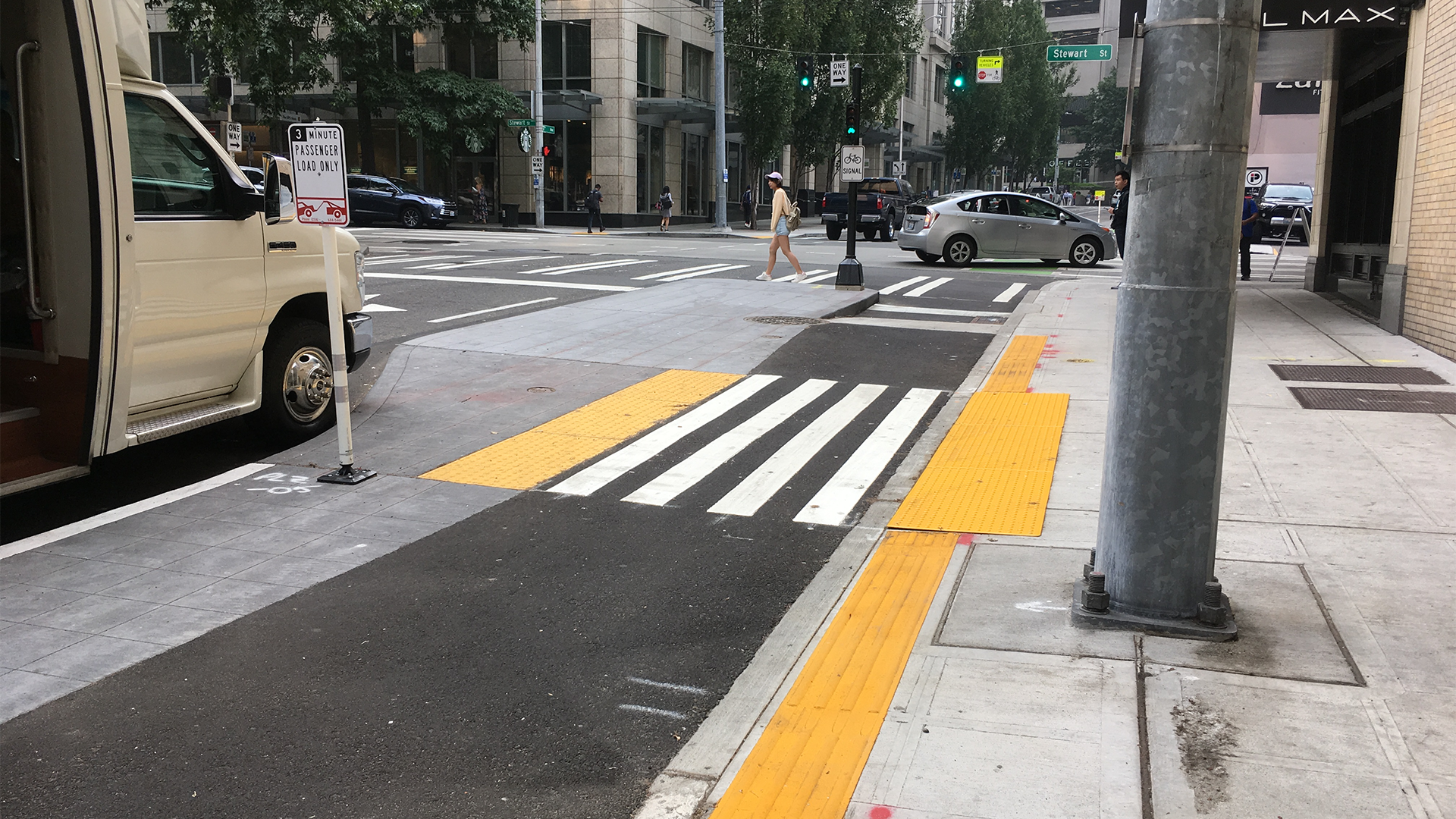
Focus group research found that thicker sections of warning surfaces were needed for people with visual disabilities to benefit and the warning surface is better suited to serve as a wayfinding treatment that a vision-impaired pedestrian can straddle.
Parallel and Flush Walking and Biking Facilities
Parallel and flush walking and biking facilities are walking and biking lanes located next to each other on a road. Sighted individuals can use clear and present markings to differentiate between the level bicycle and walking lanes that run alongside one another. Users with visual disabilities, meanwhile, will require a tactile cue to know where the walkway ends, and the bike lane begins.
In the UK, two detectable warning surfaces are implemented side by side, spanning both the bicycle and walking facilities. The warning surface on the bicycle lane has a raised grain that runs parallel to the flow of bicycle traffic, while the warning surface on the walkway has a raised grain that runs perpendicular to the flow of foot traffic. The contrasting grains of these surfaces cues pedestrians with visual impairments to the different functions of the lanes and can orient them as to which lane they’re in.
While there is recognition in the US that some kind of warning surface that can be reliably detected under foot or by use of a long cane is needed between parallel and flush walking and biking facilities, there has been little guidance as to what constitutes an appropriate surface.
It was found through focus group research that thicker sections of warning surfaces were needed for people with visual disabilities to benefit. It was also found that while the warning surface is highly detectable, it does not convey a message to pedestrians who are vision disabled that there is any hazard on the other side. It is better suited to serve as a wayfinding treatment that a vision-impaired pedestrian can straddle.
Introducing the FHWA’s Quick-Build Accessibility Guide
The above list of treatments, while inexhaustive, helps illustrate that quick-builds and other innovative treatments must be accessible if they are to make streets accessible. Although these treatments have made it easier to reallocate street space to better integrate users with disabilities, we still need guidance on how to communicate to users with disabilities that reallocation has taken place at all.
To fill this need, we are collaborating with the Federal Highway Administration on an innovative new and quick-build accessibility guide, to be published in 2023. This guide will offer best practices on implementations that integrate users with visual disabilities, drawing on findings from intensive fieldwork, focus groups, and workshops done in collaboration with disability activist groups.
The guide provides recommendations founded upon on-the-ground research. Conducting fieldwork in tandem with users who have visual disabilities was what first revealed that conventional delineators and warning surfaces under two feet wide don’t work for individuals with visual disabilities, as users with longer gaits can potentially step right over them.
With its combination of proven treatments with fieldwork, this guide gives practitioners a better understanding of quick-builds that are prescriptive and flexible. It will offer concrete recommendations and empower practitioners to fit those recommendations to the particulars of their site.
We’re writing an update on our research’s findings, but in the meantime, you can get a sense of what this guide hopes to achieve by checking out NCHRP Report 672, which bases its technical recommendations on roundabout design from the user’s perspective and simulates user perspective through the use of 3D modeling.
Moving Forward
While nuanced, thoughtful guidance on how quick-build implementations can help make streets truly complete for all users, we hope this guide will also prompt a long overdue conversation about accessibility as one of the planning discipline’s central values. After all, nearly one in four Americans live with some form of disability, and, as the World Health Organization notes, nearly everyone will live with a disability (if only temporarily) at some point in their life.
Far from a niche issue, accessible design concerns everyone-in addition to integrating individuals with disabilities, such design is also better at integrating children and older adults more effectively into transportation networks. These truths should galvanize agencies to reckon with who planning is truly for and to design streets with the most vulnerable-not the most frequently occurring-user in mind.
Here at Kittelson, we work with both the short and long views in mind, bringing immediate relief to vulnerable users and identifying where sea changes need to occur to make mobility in America just. Reach out to discuss any of these ideas further!
